Challenge
Approach
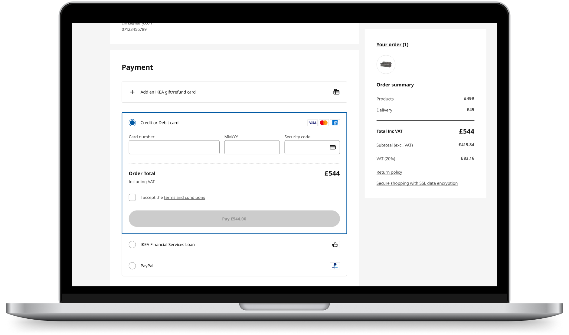
Final solution
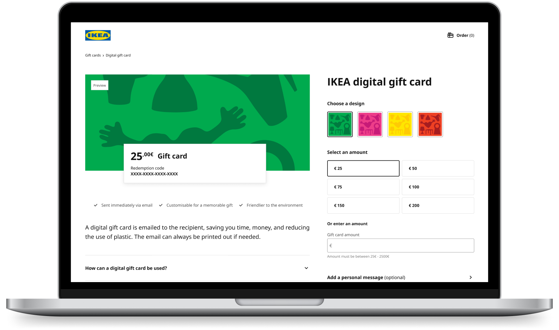
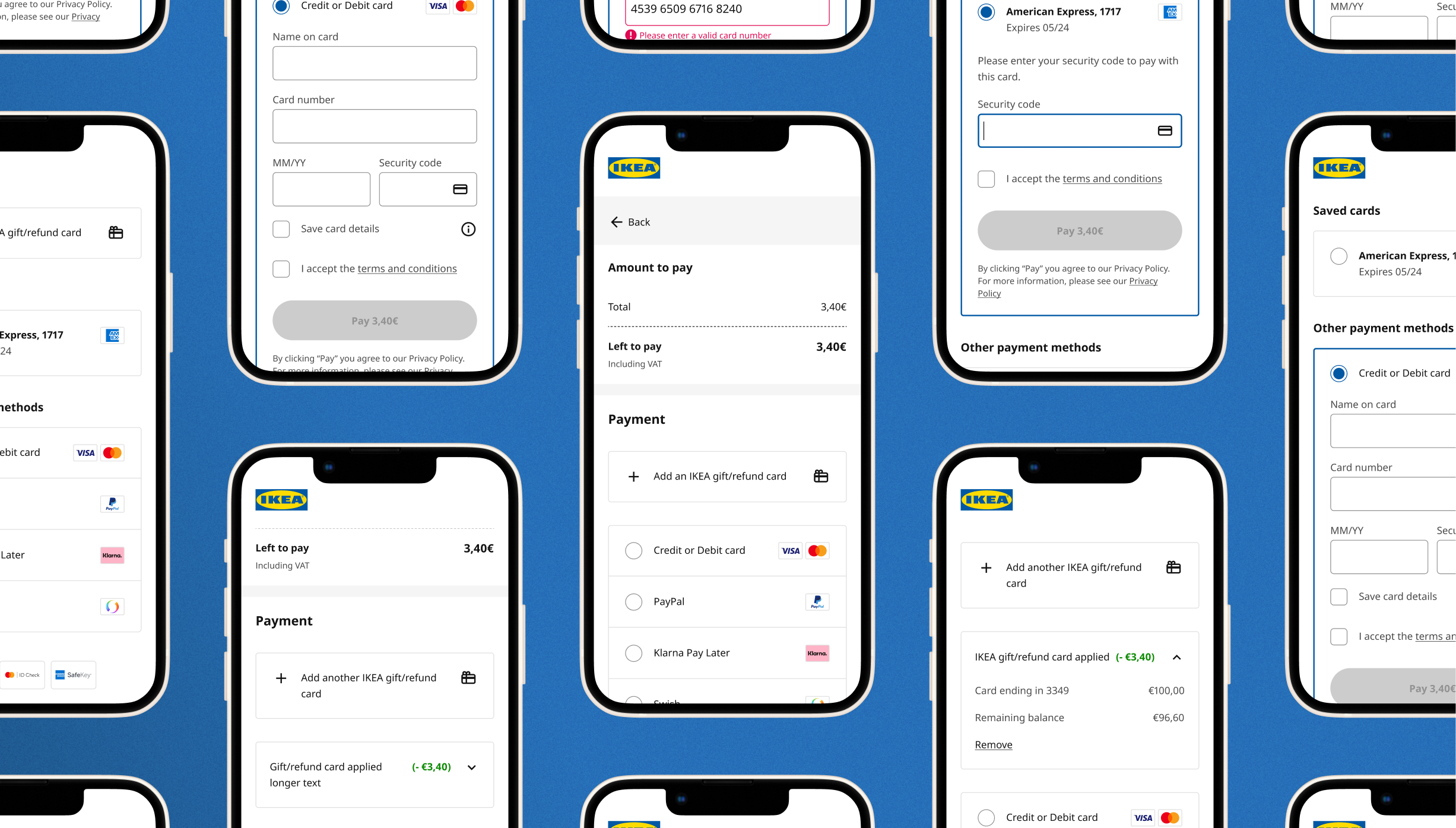
Payment is one of the most crucial steps in the online buying journey at IKEA. The numbers showed that customers were taking - on average - a relatively long time to complete the payment step, which the team hypothesised was contributing to customers abandoning that step. The existing UI made poor use of space, resulting in unnecessary scrolling and contributing to difficulty with fixing errors. Further investigation revealed that in certain markets, the UI wasn’t functioning well for specific payment methods.
I created designs that are:
- Customer-validated: 91% of customers preferred the new design over the existing experience.
- Responsive and accessible: the designs are built with accessible components and work regardless of device and payment method.
- Future-proofed: the designs can flexibly accommodate new features and can be used throughout IKEA's digital ecosystem.
We received support from management and markets to start work on preparing for a live A/B test of the new designs vs. the existing ones, which is due to go live in Q2 2025.

I was the only Product/UX designer in the product team, responsible for the following:
- Discover: competitor research, 'edge cases' analysis, journey mapping
- Design and deliver: prototypes, user testing, high-fidelity UI designs