Challenge
Approach
Final solution
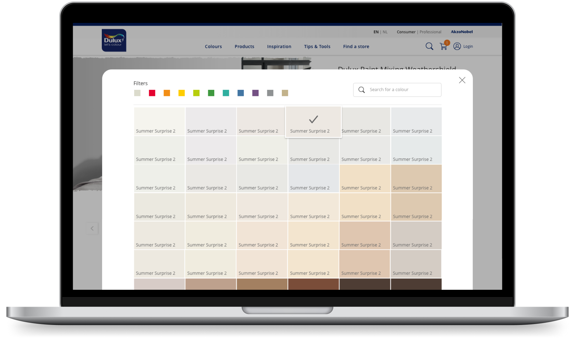
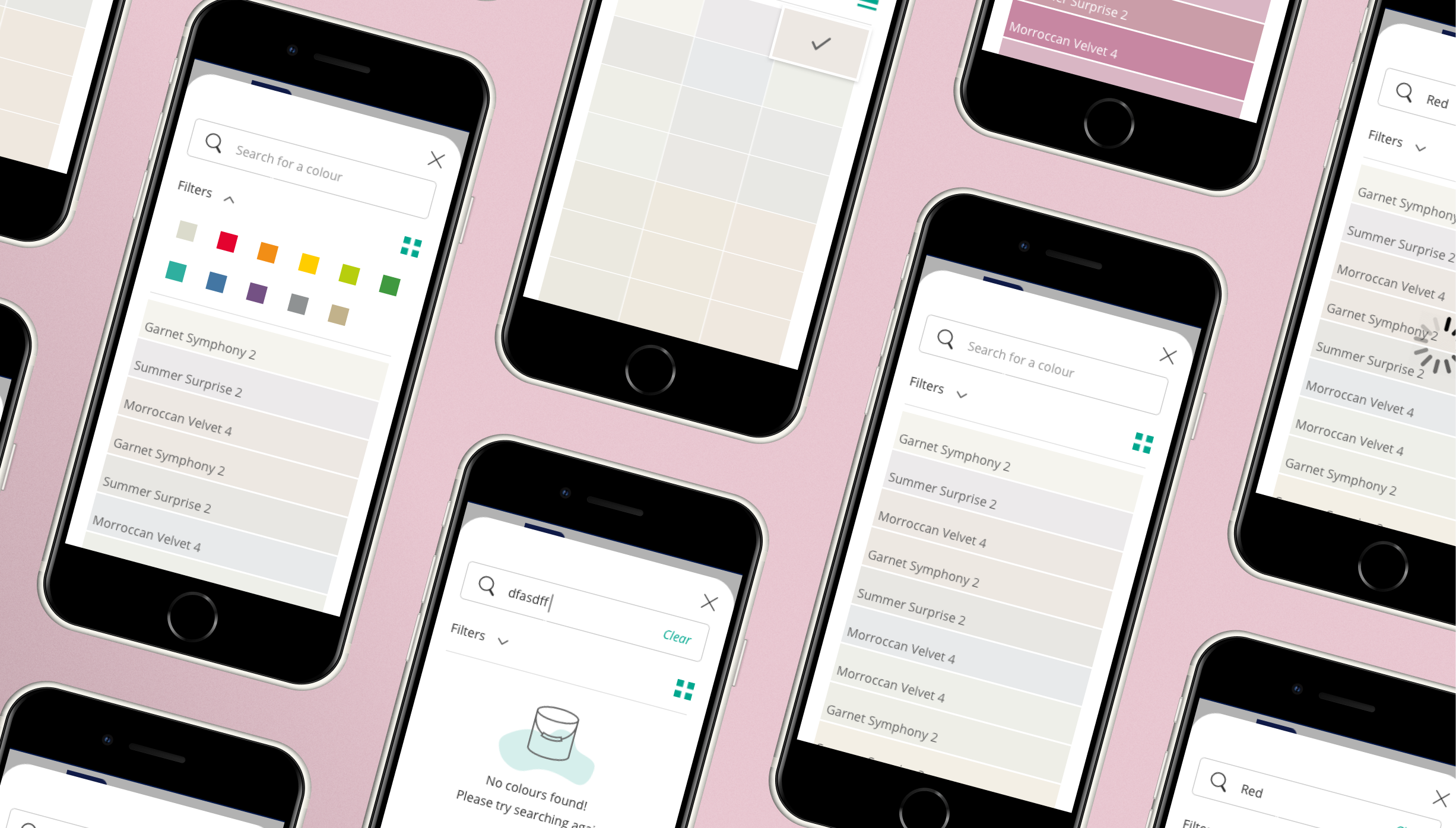
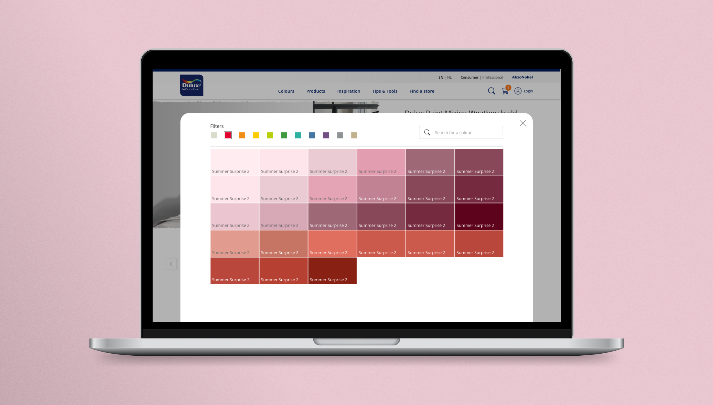
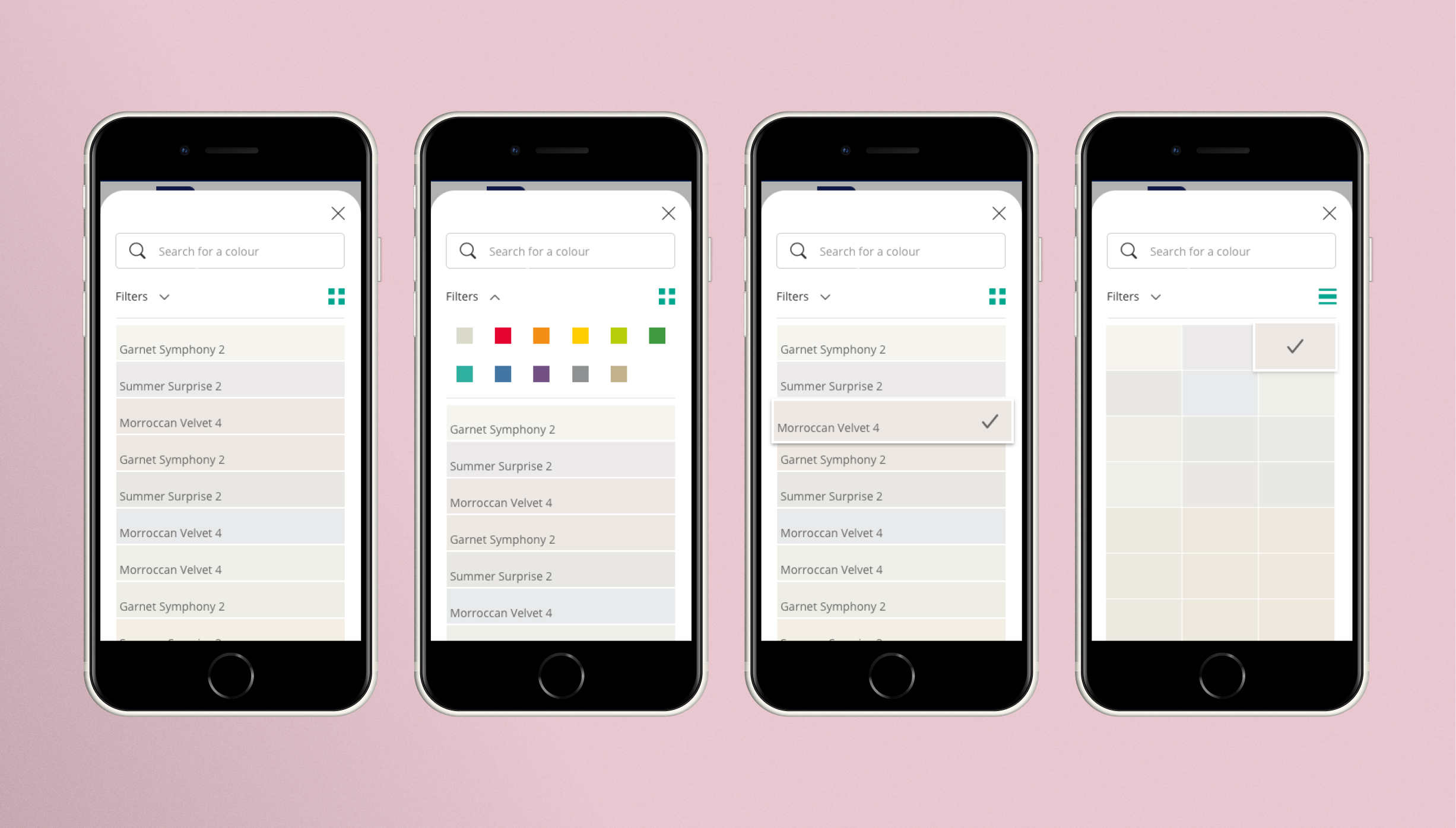
AkzoNobel is a global chemical paints company, behind such well known brands as Dulux, Flexa and Sikkens. One of my projects for the consumer brands platform focussed on the product to colour flow. This flow describes the journey a user takes from the PDP (product detail page) to select a colour for a product. Google Analytics data revealed that few users actually completed the process, so the goal was to redesign and validate the flow to ensure that more users successfully completed the journey and, ideally, converted into a sale.
- Collaborated with client stakeholders and the development team to optimise an alternative solution for the product to color flow.
- Produced annotated UI designs and refined them with developers.
- Prepared designs for a live A/B test to validate the concept.
I worked on both the UX and UI design and also supervised an intern, who supported me in this role during his final graduation placement. Together we did the following:
- Discover: as-is flow, data analysis, in-store research
- Define: experiment set-up, edge cases and other scenarios, design considerations
- Design and deliver: wireframes and iterative UI designs, filter logic, annotated flow, refinement